
Soggy bottom
Soggy bottom
Have you ever ended up with a soggy bottom? It’s so disappointing, all that time and effort. That’s the thing with baking, it just takes one part of the process to be poorly executed and you end up with a disappointing result.
Well, the same can be said about graphic design. When the kerning hasn’t been set right on type, you end up with a design that hasn’t risen to the high standards required.
When I point out poor kerning to friends or family, I often get the rolling of the eyes or a vague expression on their face. That’s because many people are unaware of kerning and rightly so, after all, they are not designers.
Although many people may be unaware of the technique and importance, without it, great design can visually look poor. Every part of the design process should stand up and be counted, thoroughly considered and well crafted. I see so many examples of design where poor kerning has let the side down!
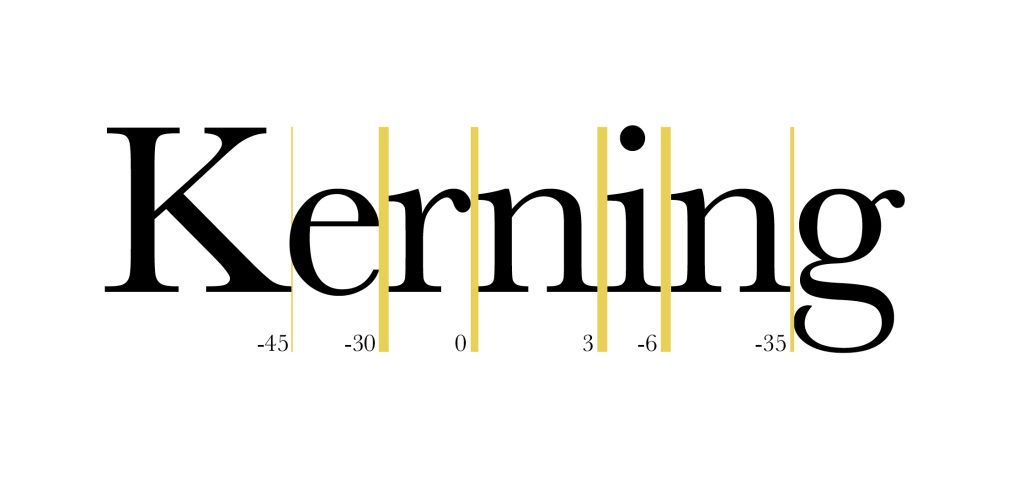
So, what is kerning? Well, often ignored or forgotten about, Kerning is used in typography to adjust the spacing between letter forms, so the range of characters are visually pleasing on the eye.
In general, certain rules and principles should be followed when setting type and adjusting space between letters. Kerning has changed with advances in technology and certain software programs provide auto kerning but this is often not sufficient. Manual kerning is essential, this gives the designer greater control and should always be part of the design process. It’s not an exact science but the manual adjustments and nuances can help mitigate many optical illusions that appear when two characters are paired together. Ultimately, it’s about the perceived space between letters so that it looks right.
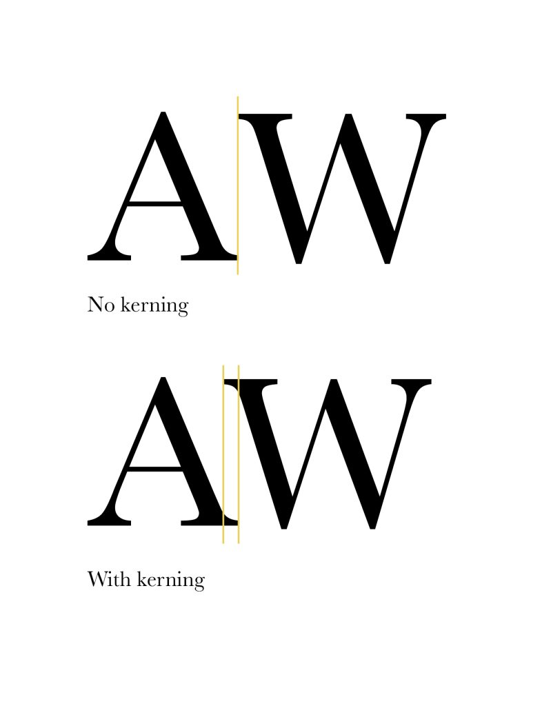
Pay particular attention to important text such as headlines, logos and straplines. Certain letter combinations, for instance ‘AW’ or ‘WA’, can be tricky and often will require kerning, especially when set as capital letters. Different font styles may require varying adjustments across the same letter pairings.
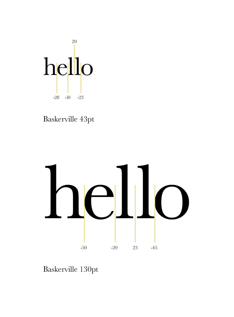
Font size can also affect the amount of kerning needed. The spacing on larger type is more noticeable so will require more adjustment than the same type set smaller.
Often the type face or content may change during the design process so I would generally advise you kern once the design is signed off. Incorporating kerning as part of the art working stage is also a great way of it becoming part of your routine.
Above all though, it’s a skill that can polish and finesse the design, so it looks balanced and refined. These final adjustments separate great design from the average and avoids disappointment.
Be warned though, once you start to spot you won’t be able to stop!
Les Abraham
Recent posts
-
23rd May 2024
From equality to equity – the changing face of EDI -
22nd June 2023
Why go looking for your inner child? -
8th June 2023
Why employer-supported volunteering does everyone good