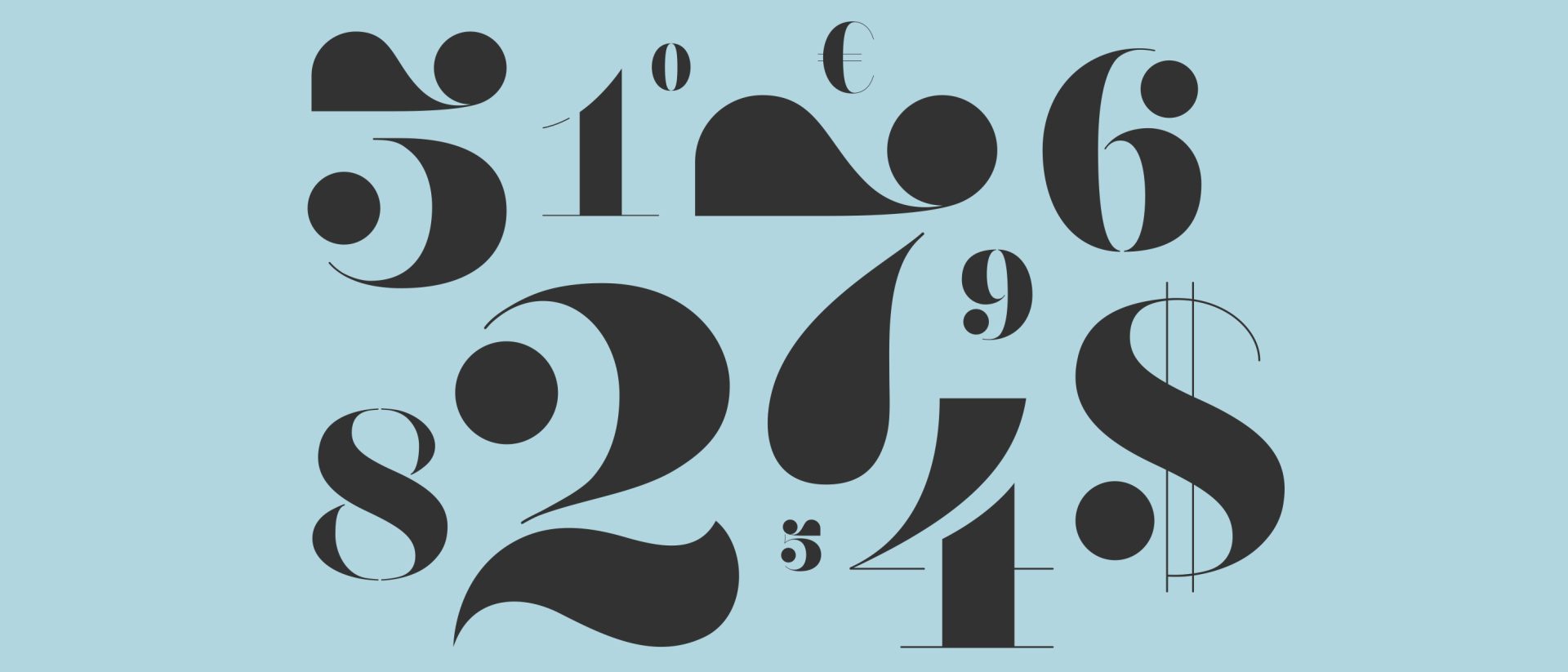

Typography with emotion
Typography with emotion
When people think of typography, more often than not, it still conjures an image of the printed page, static letterforms, legible but not always necessarily emotionally felt. We have all encountered something where the use of type makes that something more memorable, beautiful or meaningful. Sometimes the reason it stands out remains a mystery to the viewer. To the untrained eye, good design is often invisible.
One of my design heroes, Phillipe Apeloig, uses this observation as the basis for his typographical explorations. His work appears so effortless in its visual appeal. Perhaps because he draws inspiration from other, more fluid, art forms such as painting, dance and music. He approaches each new piece with fresh eyes, believing that to stick to what you know is a pretty dull rule to live by.
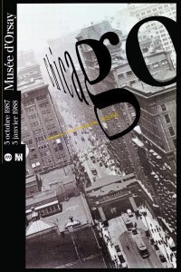

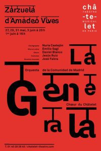

By challenging the versatility of type in design Apeloig gives it the freedom to break out of the two-dimensional and take on its very own personality. Even in his early works, which were mainly printed pieces, there is obvious movement and visual illusion. He views type as almost a piece of performance art, seamless in its transition from print to digital. Kinetic typography (animated type) features heavily in his work. Type dances elegantly around the screen, no longer frozen in time on a page.
I recently had the chance to work with one of our animators, producing a short piece of kinetic typography for a client. We’d shown them some examples to whet their appetite and they became very excited at the possibilities. So much so that they experimented with their own homemade animation using a popular and accessible animation app! Ok, it was rough around the edges but the copy and tone of voice had energy. At that stage, however, they couldn’t see how the cost of getting a designer and animator involved correlated with the quality of the final outcome. They agreed to take it step by step and as they saw the animation coming together their outlook on the value of the piece changed entirely. It was speaking to them. Making them feel. If it spoke to them in that way it would also emotionally engage with their audience.
“It is true that designing letters is still rather obscure in the eyes of the public. Typography belongs to the world of the non-remarkable, behind it is concealed an astonishing mass of work the reader knows nothing about. Fonts share our lives with neutrality, modesty and greatness, they are the raw material of communication, in the service of men and their exchanges.” Phillipe Apeloig
Revolutionary designers like Apeloig reveal type in a new light for people. Non-designers can begin to appreciate the beauty in letterforms because it’s their shapes and interaction with each other that take centre stage and convey a feeling as well as a message.
So, next time you see some letters on a page, remember, they almost certainly have a secret life. One where they perform to a captivated crowd in a sold-out show every night. If you treat them well they might just let you in to experience the magic.
Lesley Nichols
Recent posts
-
23rd May 2024
From equality to equity – the changing face of EDI -
22nd June 2023
Why go looking for your inner child? -
8th June 2023
Why employer-supported volunteering does everyone good
