enza
Challenging the challenger brands
Over the last decade a growing number of fintech challengers have delivered new payment options for individuals and businesses across Africa, leaving more established banks trying to keep pace. enza, led by a group of respected finance experts, are helping banks fight back with innovative payment solutions that not only radically increase their competitiveness, but at the same time help democratise payments for all and enable a more financially-inclusive continent.
enza needed to establish a strong brand position and a defined look and feel that would not only take the challenge to futuristic fintech companies, but also set them apart, reflecting their singular place in the market as trusted experts in Africa.
The solution
Working closely with enza’s team across Africa, we held a series of positioning workshops to carry out a detailed exploration of the market, the opportunities and the unmatched benefits of their innovative service and technology. The result was a unique and differentiated brand proposition with a distinct look and feel and a confident voice.
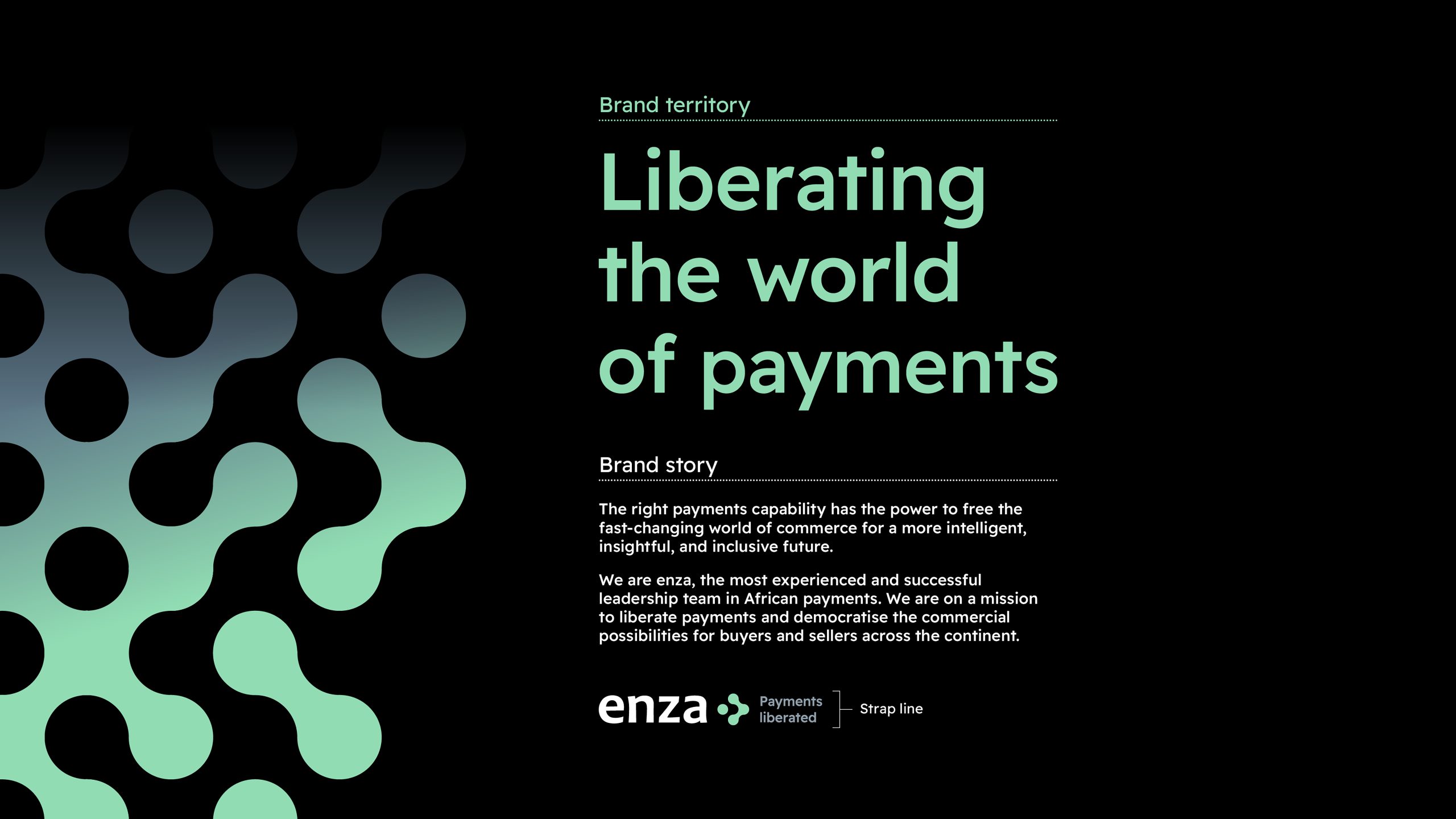
Brand positioning
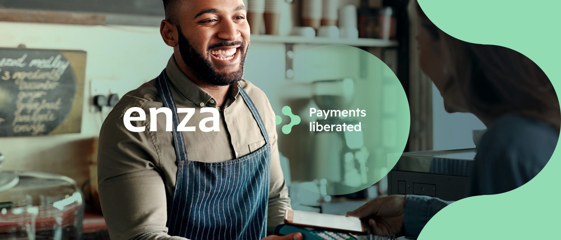
It became clear that payments are not just a monetary transaction. In the right hands, with the right technology and the right vision, payments can free the fast-changing world of commerce for a more intelligent, insightful and inclusive future. Our brand positioning – Liberating the world of payments – is a powerful expression of the freedom, flexibility and potential that enza offers banks, businesses and individuals across Africa.
Visual identity
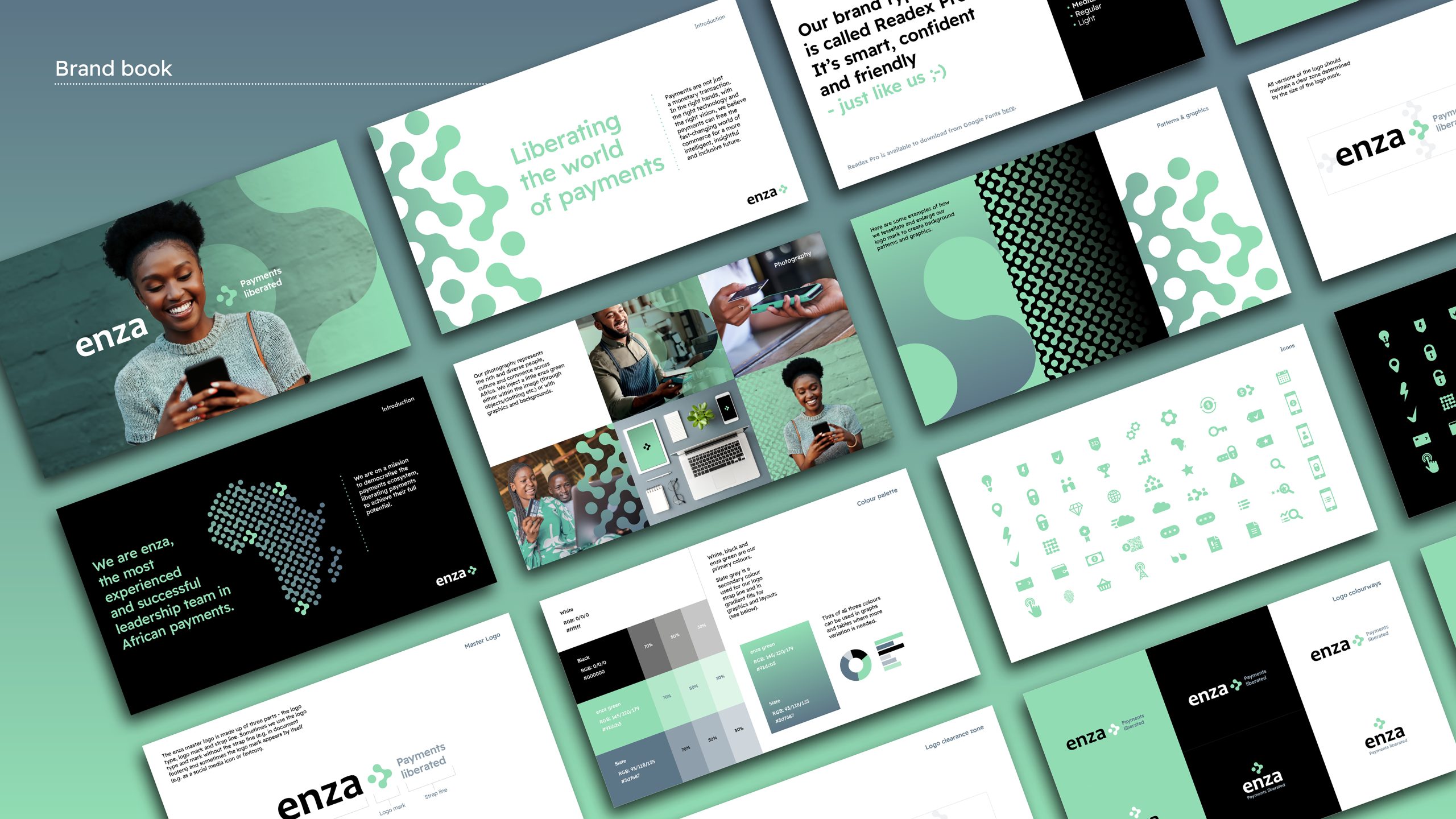
enza needed a bold and confident look that would stand out in the fintech space but also express their unique place in the African market. Moving away from their existing grey and blue corporate colours we devised a fresh, striking, ownable colour that feels future-focused, but also friendly and accessible. This contemporary, open vibe is also reflected in the san-serif typeface.
The logo mark is a key part of the identity, illustrating the central idea of connections – between banks and their customers, businesses and consumers – the myriad transactions that make up Africa’s commerce. The mark’s building block system can multiply and flex to create endlessly variable patterns, suggesting forward motion – it’s a design that can evolve like the brand and demonstrates the liberating power of payments that enza offer. Both individual and collective, the mark is a symbol of the democratic potential of payments across a continent.
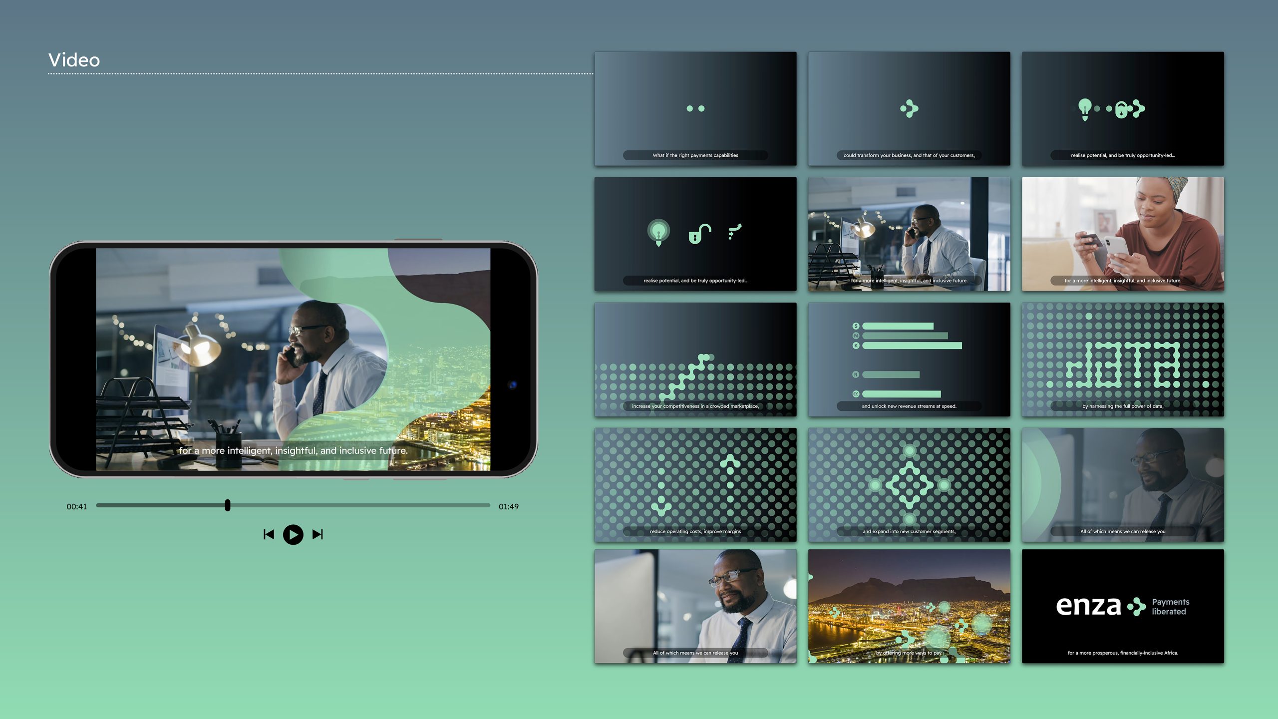
Video
We needed to be able to sum up the opportunity of the enza offering in a way that would grab and hold attention for an audience that is time poor, and often held back by legacy technology. Our video captures the liberating power of the enza solution and the experience and expertise of the enza team, bringing it to life in a way that is visually both simple and memorable.
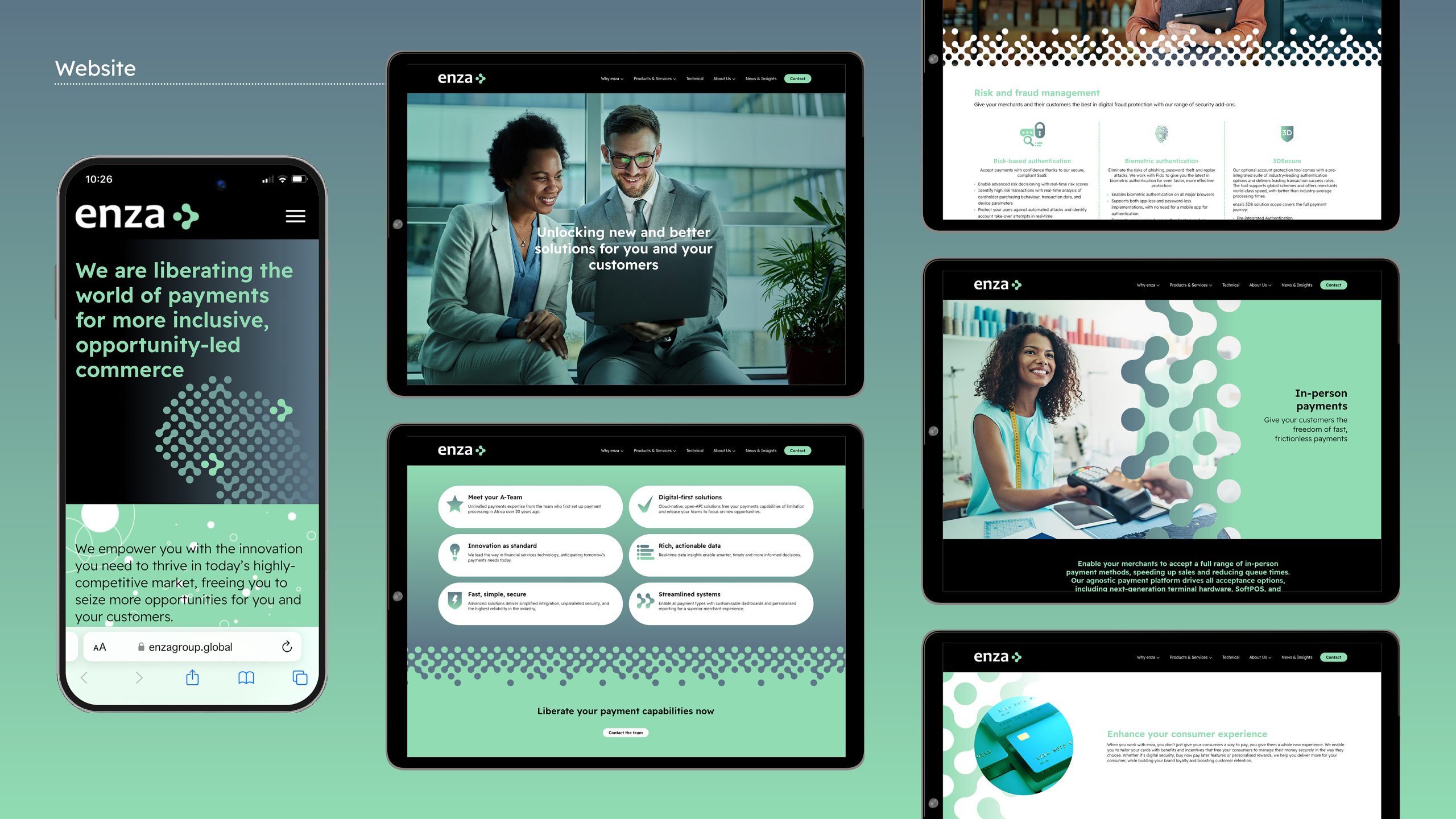
Website
As the first touchpoint for any enquiry, we designed a website that was both impactful and supremely user-friendly. enza’s liberation message was clearly delivered through concise, energetic copy that highlighted the benefits for their clients, while the visual identity was established in a bold, visually rich manner that was also refreshingly clean and simple.
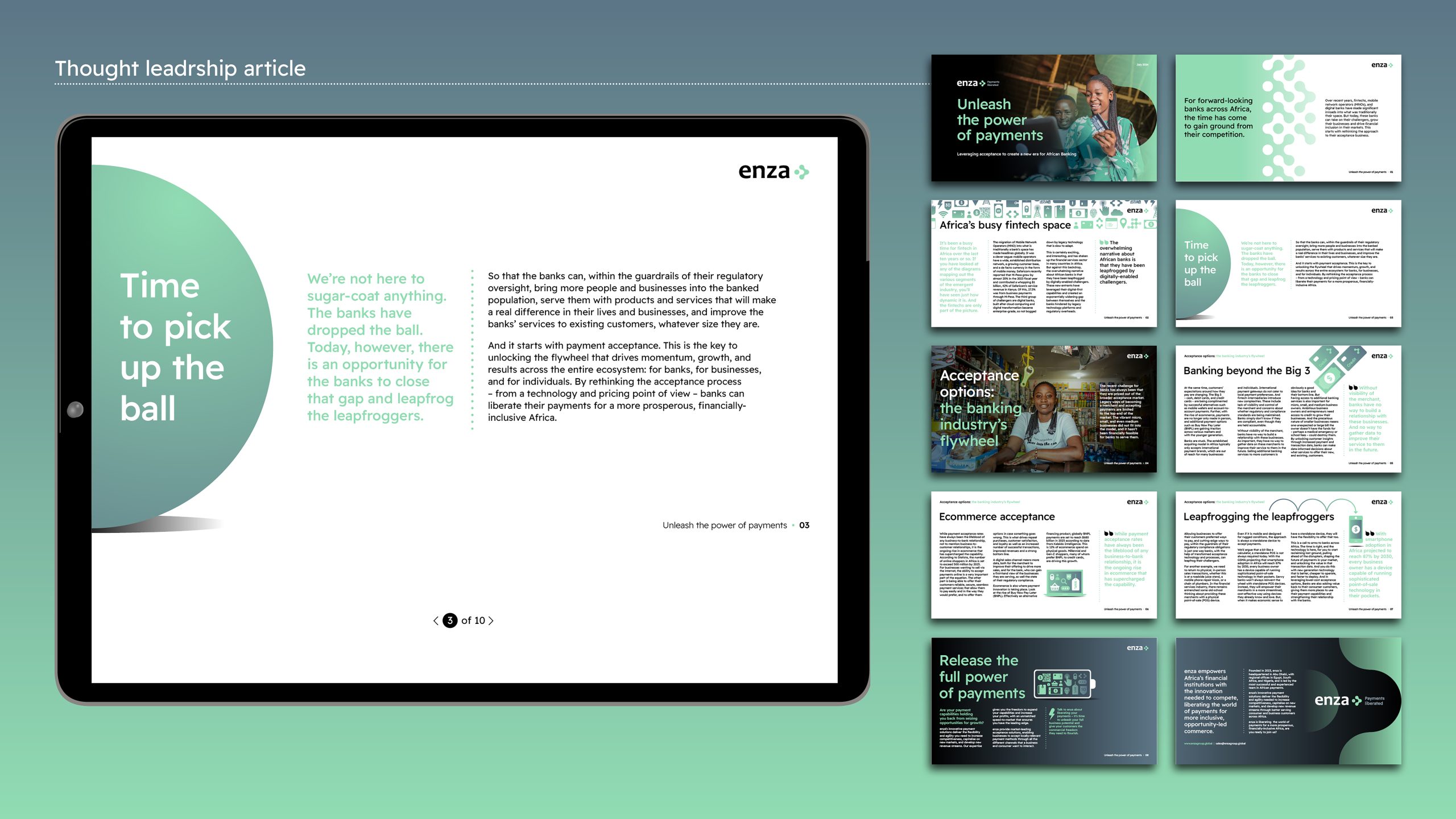
Templates and documents
We created a range of easy-to-use branded templates that enable the enza team to present the brand clearly and consistently across all their communications.